|
Copyrighted Material -CLICK for information |
|
Back |
| Tips on Book Design
The Golden Age of Books on Illustration Artists I love books on illustration and illustrators. Anyone who is willing to create and publish such a book is to be commended. Period. Yet, I can’t help thinking that, while all books on illustration have merit, some elements just aren’t done very well, and they’re not done very well from book to book, publisher to publisher, year after year. This article is meant to suggest ways to stop making these same mistakes. Before continuing, keep in mind that I’m not out to hurt anyone’s feelings, nor would I know who’s feelings to hurt even if I wanted to because books are collaborative efforts. It's just that I think we can do better! The Most Repeated Crime in All Bookdom! Here's the one simple thing to remember when publishing an art book: THE ART. Nothing should detract from that. Collier's understood this when they published "Thirty Famous Paintings" back in 1908: all images appear on their own pages and since the book is horizontal in format, sometimes the viewer has to turn the book to see vertical images. Never is an image sliced or diced in any way |
|
|
|
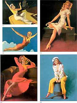
What Does Good Page Layout Look Like? The page at below is from Martignette and Meisel’s The Great American Pin-up. It shows five images of various sizes all sitting on a single page. And it looks great. There's plenty of room for each image to breath and the white borders show discreet, small image numbers. The smallest of the Earl Moran girls on this page is 2.5 x 3.5. This should be the absolute smallest your image gets, though I still find it stingy. Post card dimensions of 4 x 5 would be a better "smallest" size. That said, the print quality on this page is excellent and the mixing of smaller and larger images on the page works well. In fact, you could do no better than to study the entire, The Great Amerian Pin-Up. The print quality, color images, and overall layout are champion. The full-page images (and there are dozens) bleed to the full 12 x 9.5 page size. Most of the smaller images are quarter page. Pages have plenty of white space where needed and each page has a good mix between text and images. A niggling complaint is that the san-serif text is a little light in weight (at least for these eyes), but the writing is informative and covers a lot of ground, especially considering that you won’t find writing on most of these artists anywhere else. |
 |
|
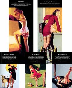
Page Crowding and Other Boo-Boos Even a flawed Elvgren book still has the benefit of Elvgren art, but in this monograph, the artist takes a backseat to the layout. Take image 255, “Blanket Coverage,” part of a collage below. It’s a nice size image, one of Elvgen’s creamy girls. The problem? A huge white “255” has been added, part of the book’s keying system. It's there in the upper left, white text against the white clouds. Why? And the question must be asked, why a collage? Notice that image 255 covers part of image 258. Is this something Elvgren asked for in his will "Make sure you cover the right corner of that painting whenever you print it. I HATE that corner." The page as a whole is cluttered and busy and most of the book is like this. Because the layout is so obtrusive, the book becomes less about Elvgren and more about the person who designed the book. Not good! It also suffers from Microscopic Graphic Syndrome, as clearly (or not so clearly) shown in the Elvgren girl upper right. How small is she? SMALL! I still like the book, it has heaps of useful text on Elvgren (and other artists) and some images aren’t available anywhere else, but I have to sigh every time I take it off the shelf. |
 |
|
Happily, there’s yet another monograph on Elvgren, Max Allan Collins and Drake Elvgren’s “Elvgren, His Life and Art” published by Collector’s Press. Unhappily, it suffers from most of the same bugaboos as the other Elvgren book. It also adds new problems: black text boxes that cover parts of Elvgren's art. There’s also a persistent page numbering that intrudes on several pictures. Actually, on thumbing through it again, it was hard to find an image without something intruding into it. Is this a good book? Sure, lots of detailed info on Elvgren, still more images not seen elsewhere (especially ads; I thought those Panghorns looked like his style) and many examples of Elvgren’s models being posed and the finished paintings from those poses, but the clutter is a needless distraction and detraction. I would recommend both of the Elvgren books not only for the well-written text and the examples of Elvgren work you don't usually see, but also as examples of how not to let a layout get away from you. Keep saying to yourself, it's about the artist first and foremost. Everything else is secondary (and probably unnecessary). |
 |
|
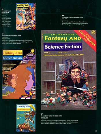
The last example, below, is from "Art of Imagination." With such big pages and so many of them, you'd be right in thinking that most of the images are a good size. But Microscopic Graphic Syndrome does rear it's teensy head. Those postal-stamp-size examples of Hannes Bok and Vaughn Bode on this example page are so tiny they can't be appreciated. Why did they bother? Don't Colorize Black-and-White Movies OR Black-and-Whiteize Color Illustrations When color photography became the norm, art books still leaned heavily on de-colorized images. Even into the 1970s, books on J M Flagg, J C Leyendecker, Coles Phillips, Frank Schoonover, N C Wyeth, and others, used grey-scale instead of color. Patricia Janis Broder's "Dean Cornwell, Dean of Illustrators" was reprinted courtesy of Collector's Press (thank you!). There's lots of color in this reprint, but there are lots of color images that were left in black and white. I'd rather they updated the graphics to color (yes, I'd pay more) or left them out altogether. |
 |
|
Points to Remember
|
|
